I am a big title sequence nerd (one of my favorites is Catch Me if You Can). So I was extremely excited about this project, in which students were to pick a movie or show to make a title sequence for that is 80% or more typographic.
About this project
Class: Type in Motion
Professor: David Wolske
Class: Type in Motion
Professor: David Wolske
My role
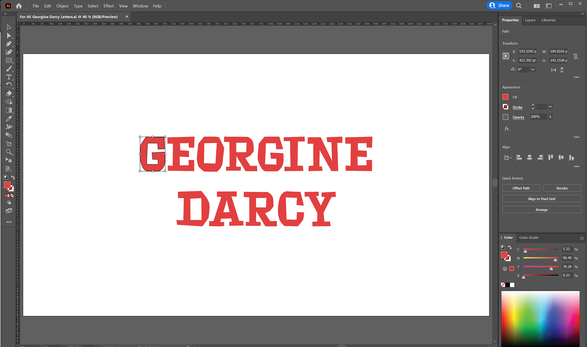
Brainstorming, Storyboarding, Art Direction, Animation using After Effects.
Brainstorming, Storyboarding, Art Direction, Animation using After Effects.
There's an Easter egg at the beginning of the video. Watch closely to see if you can find it, or scroll to the bottom of this post to find out :)
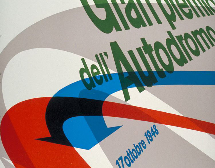
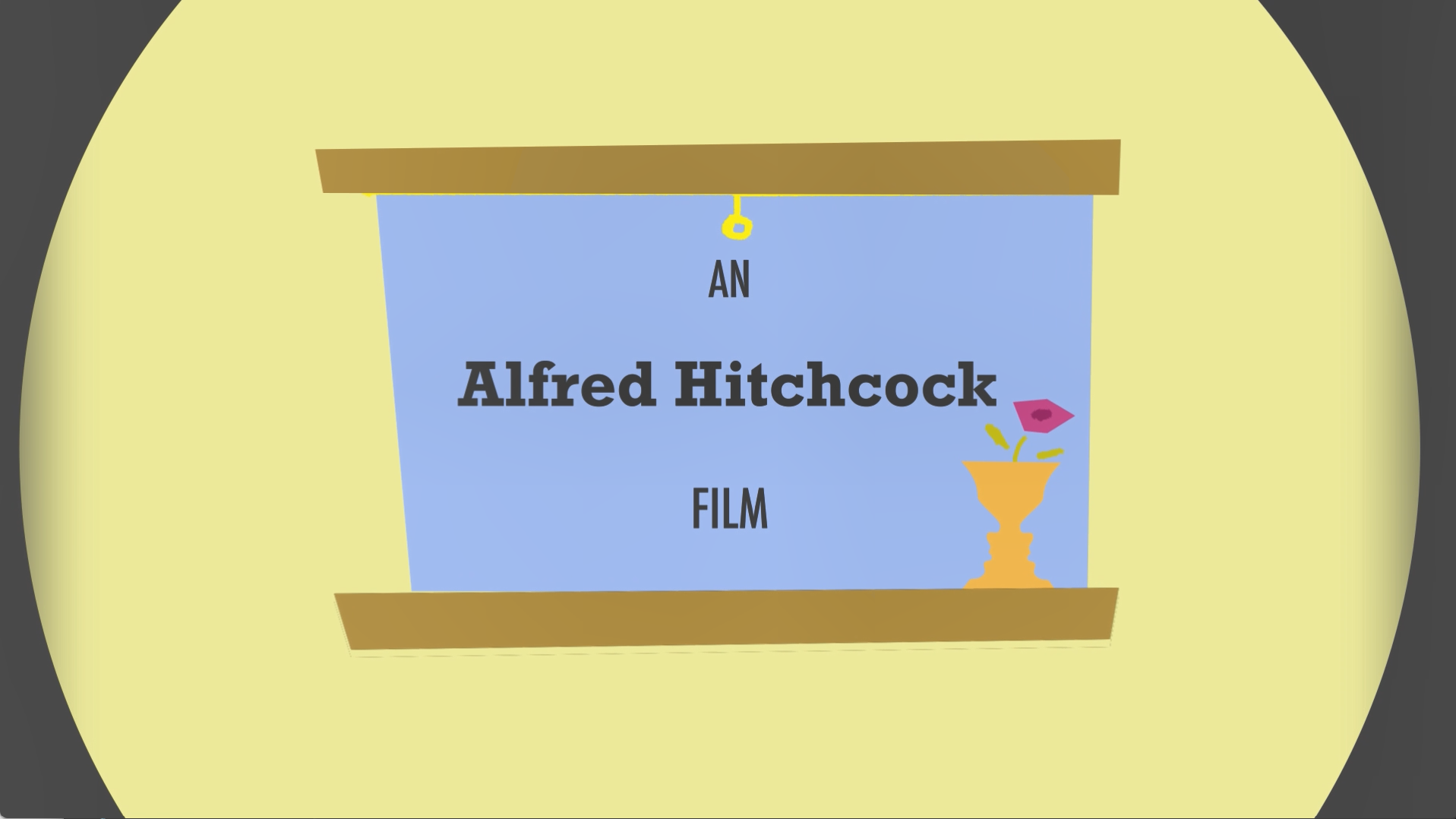
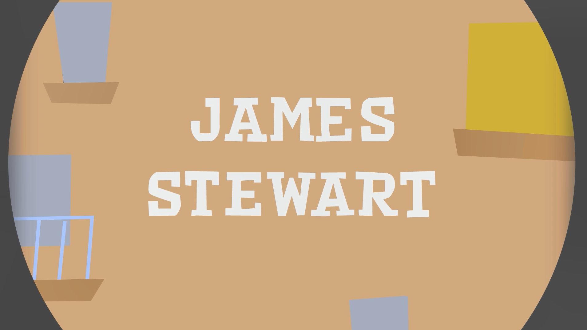
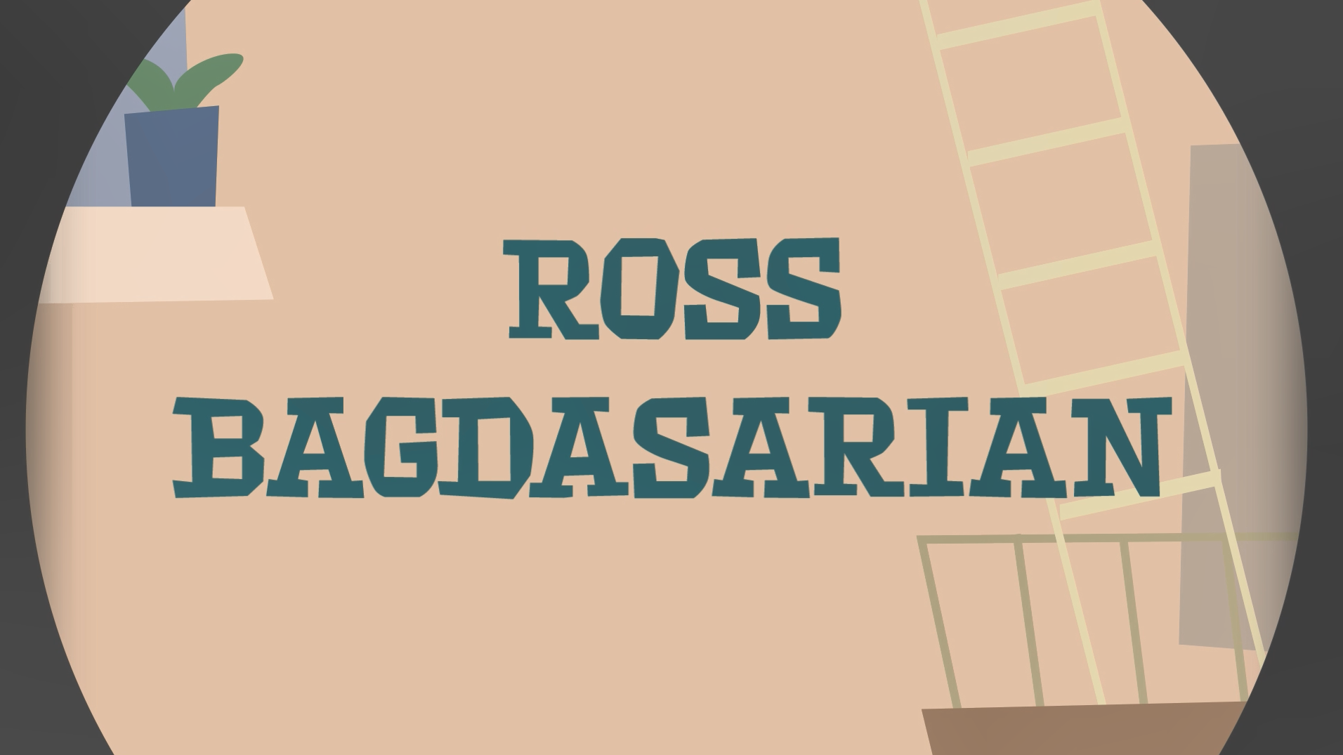
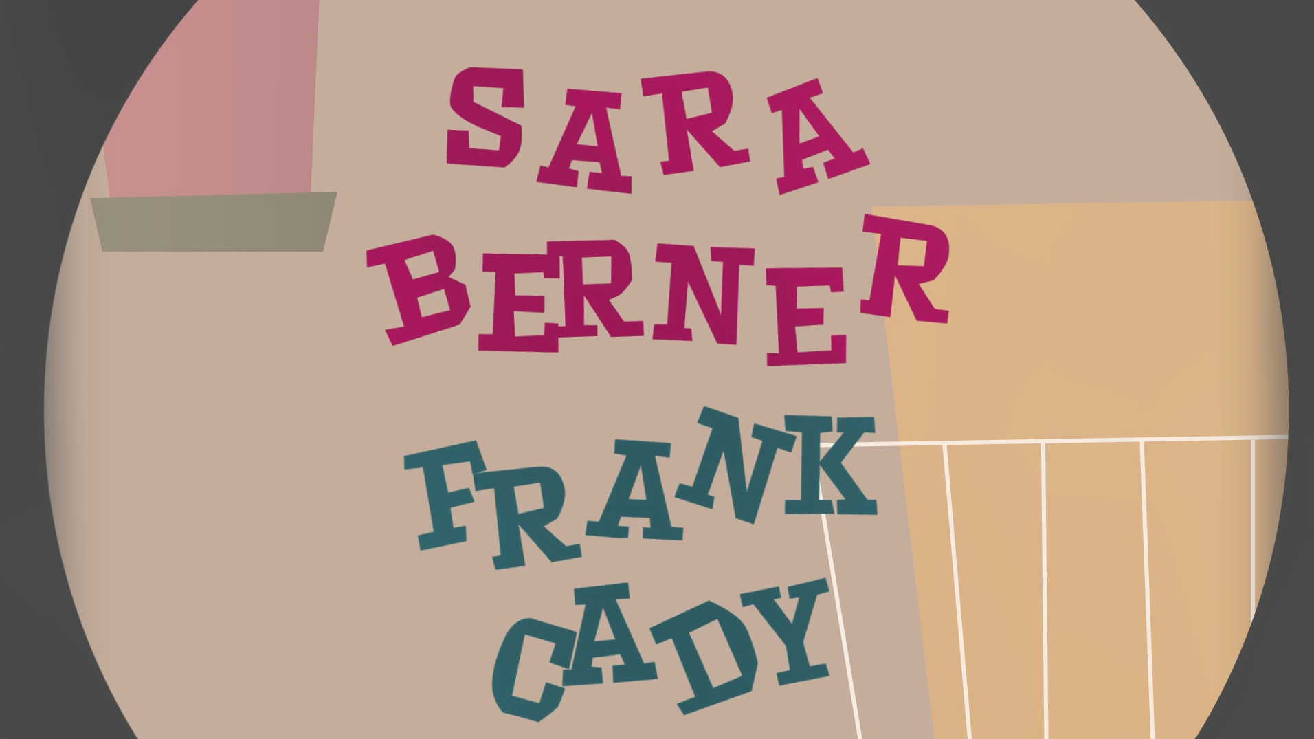
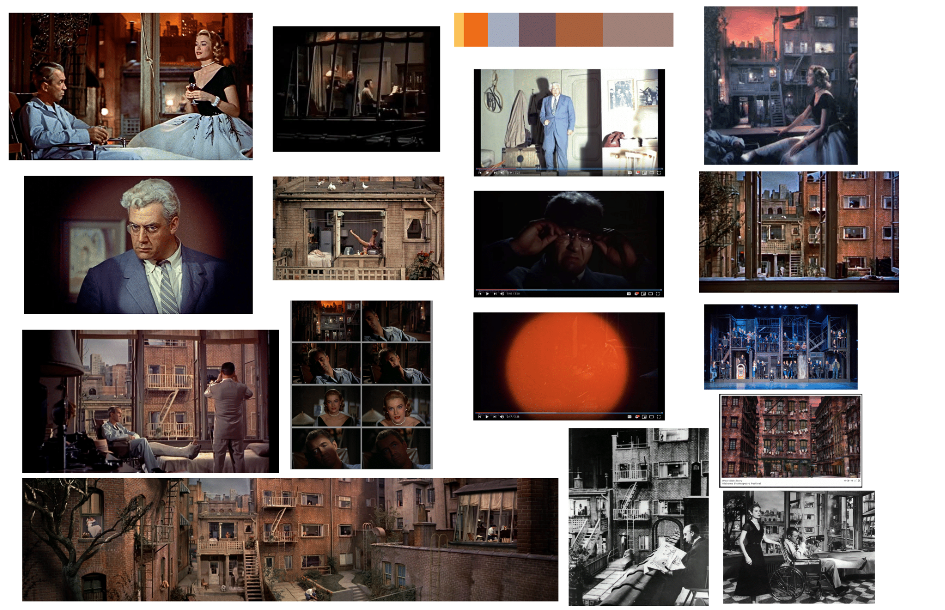
This was the first time to work with both music and animation in After Effects, and I learned many things from this project. My design process started with re-visiting the movie Rear Window (1954) by Alfred Hitchcock and making in-depth annotations while I watched it. I then gathered contextual research about the movie and its setting. From there, I decided a Pictorial Modernism look and feel would be appropriate for this project because of the time this movie was made, as well as the humorous, energetic, and witty tones in this movie. I watched many animations and title sequence for inspirations, and started storyboarding and editing the music of my title sequence (it's from the movie's original opening scene).

Here're some of my mood boards for this project.
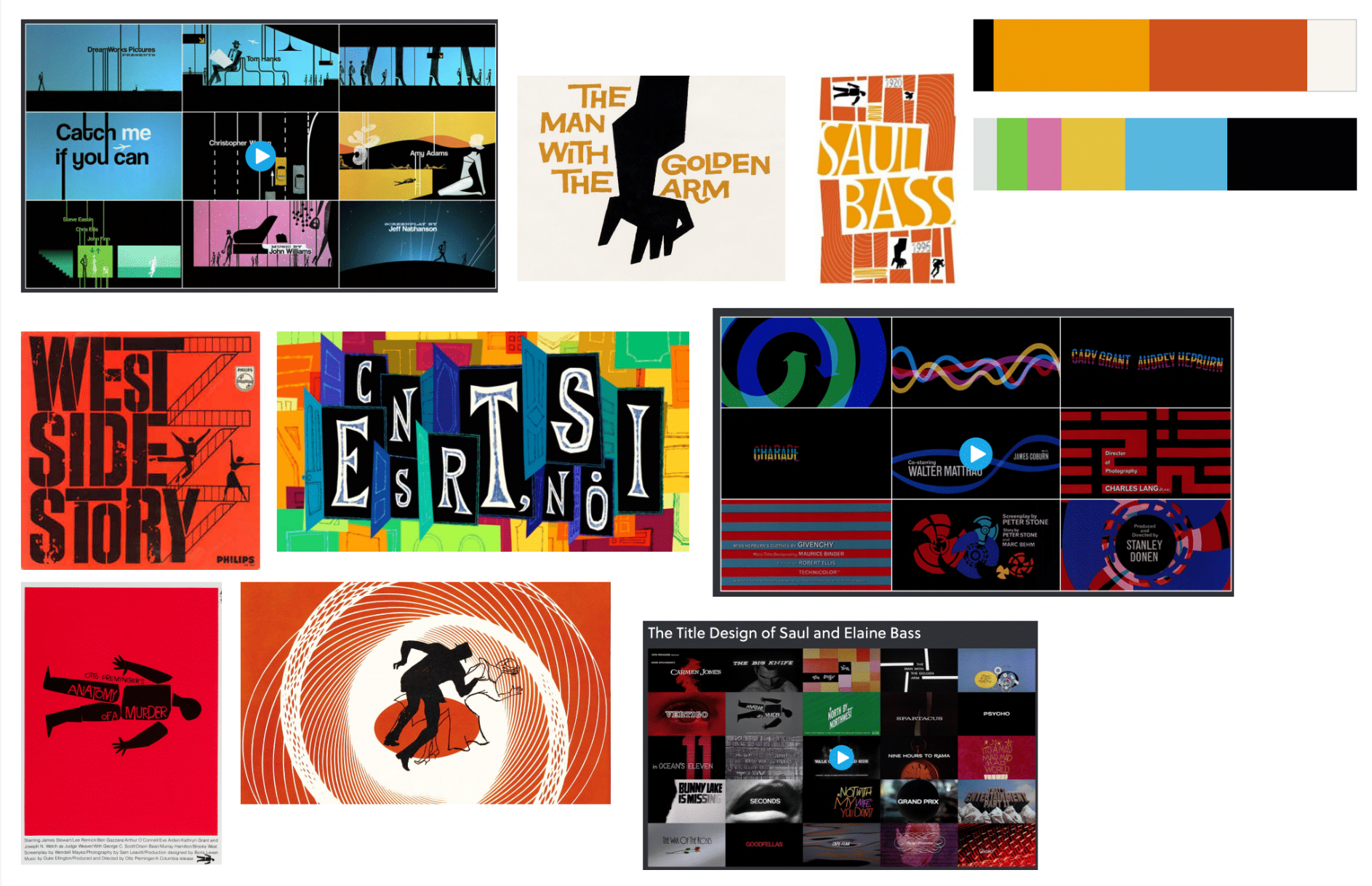
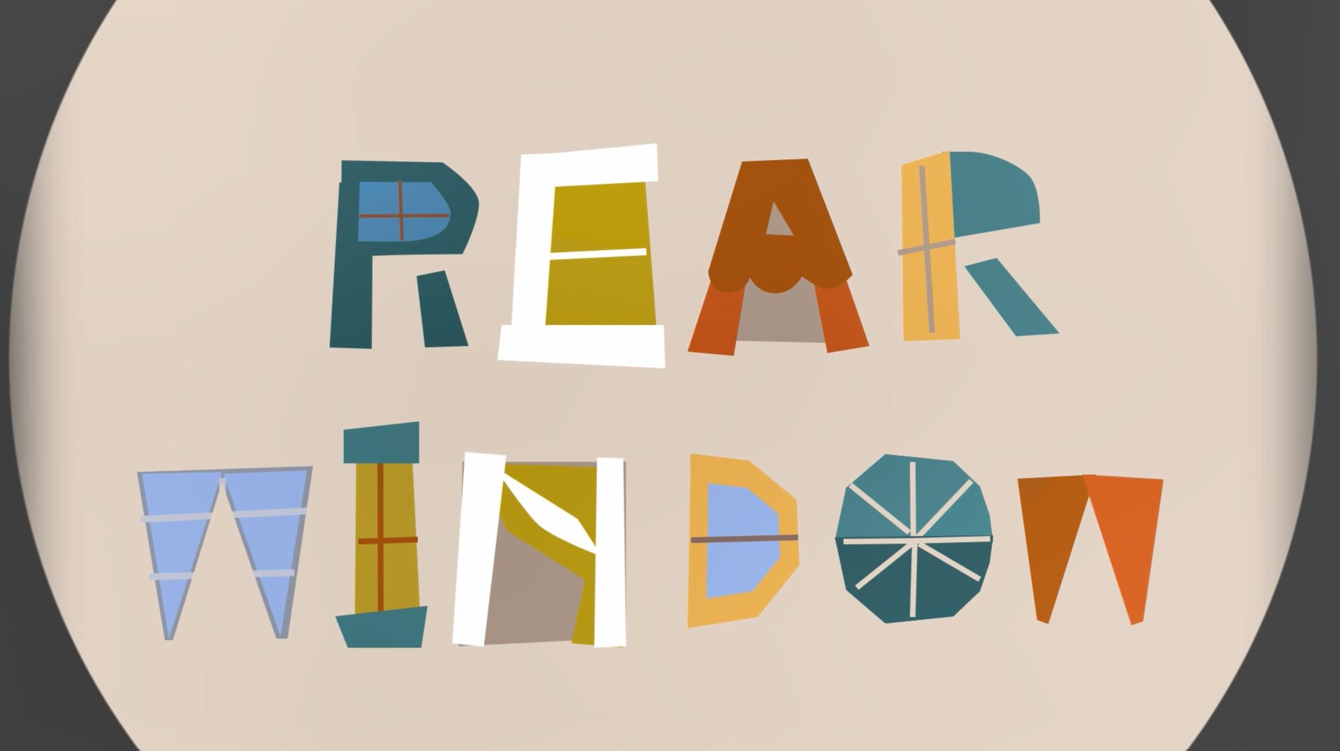
My initial direction of the movie was to use different typefaces to represent different characters in the movie, but I soon realized if I did that it would make the title sequence very incoherent due to the wildly different typefaces and colors. So I started making customized letters that were inspired by the typefaces Rockwell and Export. Every letter in all of the characters' names were individually drawn by me in Illustrator.
Easter Egg: The vase at the beginning of the video is made out of two profile views of Hitchcock (look at the negative space on both sides of the vase).
Thank you for viewing my project!